The Box Model and Layouts
In this kata, we’re going to answer the following questions:(link to the complete list of questions)
Definition🔗
Every node of the render tree (even text) is modelized by a box, and it is really important to understand how this box system works to master layout techniques and every little detail about CSS.
Every box has 5 characteristics: a width, a height, a padding, a border and a margin. Inspect those properties in your browser’s dev tools:
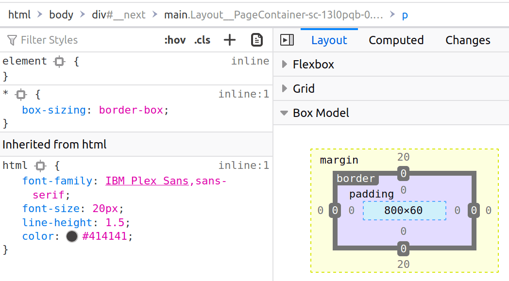
Those characteristics are different from the width, height, padding, border and margin CSS properties. What you see in the dev tools is what the box actually is, not what we ask it to be.
Let me tell it again, this is really important: for every CSS property there is a difference between the specified value in your CSS code and the value that is actually computed by the browser.
A quick demonstration: the browser might not honor the width property if there is a min-width property. Thus, the width specified property and actual box characteristics will be different.
The box-sizing property🔗
Task: try to set the width and height of the box to 100px
In the above example, something is not really intuitive: if you inspect the box with the dev tools, we end up with a distance from border to border included of 122px. Let’s bring up the box model again:
We get 122px because: 1px from left border + 10px from left padding + 100px from width + 20px from right padding + 1px from right border = 122px. This is not intuitive because most humans will consider a box what is delimited by the borders. But fear not! There is an alternate box model.
The default box model is the content-box model. The other box model is the border-box model. In this model, the width and height characteristics are defined as content + padding + border.
By setting the box-sizing property, you can change the box model used for this box.
Task: change the first box so that it is 100px wide - border to border
As the border-box model is more intuitive, it is a good practice to reset it for all elements:
Layouts🔗
The box characteristics are computed from the CSS properties depending on the current layout.
There are four main layouts to know: Flow, Table, Flex and Grid. We will see each of them in following katas. After learning all the main layouts, you’ll have a good understanding of which one is the more adapted to your specific case.
A layout is a set of rules and CSS properties to dictate how boxes will interact with each other.
Let me list some implications of this definition:
- A layout rules how CSS properties will interact. It may use specific CSS properties (such as flex-direction for the Flex layout), but it will also make use of standard properties (width, margin...)
- Layout having different sets of rules, this means that a CSS value (such as width: auto;) can behave differently in the context of different layouts
- It also means that some layout-specific properties (such as flex-direction) will be completely useless in the context of other layouts
- Layout rulesets can introduce very specific behaviors (such as margin collapsing) that will not be transposed to other layouts
- Each CSS layout has its own CSS specification
You should see layouts as a toolbox: within the context of a layout, you’ll be able to predict how elements will place next to each other. You don’t like a layout’s ruleset? Change your toolbox and use another layout.
The display property🔗
You can switch between layouts with the display property. This property have two possible syntaxes:
- display: [shorthand];: the old syntax, supported by all browsers
- display: [outer] [inner];: the new, full syntax, supported by all modern browsers (you might not have it if you have Chrome < 115)
In this kata we’ll learn this property with its full, two values syntax to better understand what happens. This syntax specify the outer display type and the inner display type.
- The outer display type
- This defines how the element should behave in the context of the parent layout, if the parent layout is Flow. Possible values are block and inline. If the parent layout is not Flow, the outer display type is ignored.
- The inner display type
- This defines how the element’s children will lay out. Possible values include flow, table, flex, grid and many more...
Think of it like this:
- Flow is the default layout;
- The outer display type will decide how the box will place itself in the Flow layout;
- The inner display type decides how the inside of the box will behave: should it participate in the Flow layout? Should the children use Flex or Grid instead?
For legacy reason we usually use shorthands, for instance:
| Shorthand | Two-value syntax |
|---|---|
| block | block flow |
| inline | inline flow |
| flex | block flex |
| inline-grid | inline grid |
Shorthands are not a bad thing and you should continue to use them, however the two value syntax is better for learning purposes.
Task: a developer tried to use the Flex layout but forgot to change the display type! Fix the problem by using the two-value display syntax.
We will see the Flex layout in a further kata, our next goal is learning the Flow layout (the default layout!).
What I should remember🔗
- Every node of the render tree creates a box
- The box model defines the box characteristics
- The border-box model is actually more intuitive
- CSS properties impact the box characteristics depending on the current layout
- The display property changes the layout by changing the inner display type of the box.