
Styling text and custom fonts
In this kata, we’re going to answer the following questions:(link to the complete list of questions)
Basic text styling🔗
At last! We are going to learn other properties than this silly color property that we used everywhere in previous katas. There is a lot of properties that can manipulate text, a good schema is worth a thousand words:
A line layout can be changed with the following properties:
- font-size
- Changes the height of the letters. For better accessibility, never use the px unit for font size, use em or rem instead (see previous kata). For better readability, never go a computed value of below 15px. The default value of body text for most browsers is 16px and most websites will need a computed value between 16px and 21px. Don’t hesitate to go bigger if your content is made of a lot of text (for instance, this website uses 125% computed to 20px for its body font size).
- line-height
- Changes the height of the line. As a consequence it will also modify spacing between lines in a paragraph. A good practice is to use a relative unit and 1.5 is a good standard value for better readability.
- word-spacing and letter-spacing
- Changes the space between words and letters. Usually the default should be ok.
Cosmetic properties🔗
Now we can make our text fancier. Here is a list of some useful properties:
- color
- Quite straightforward.
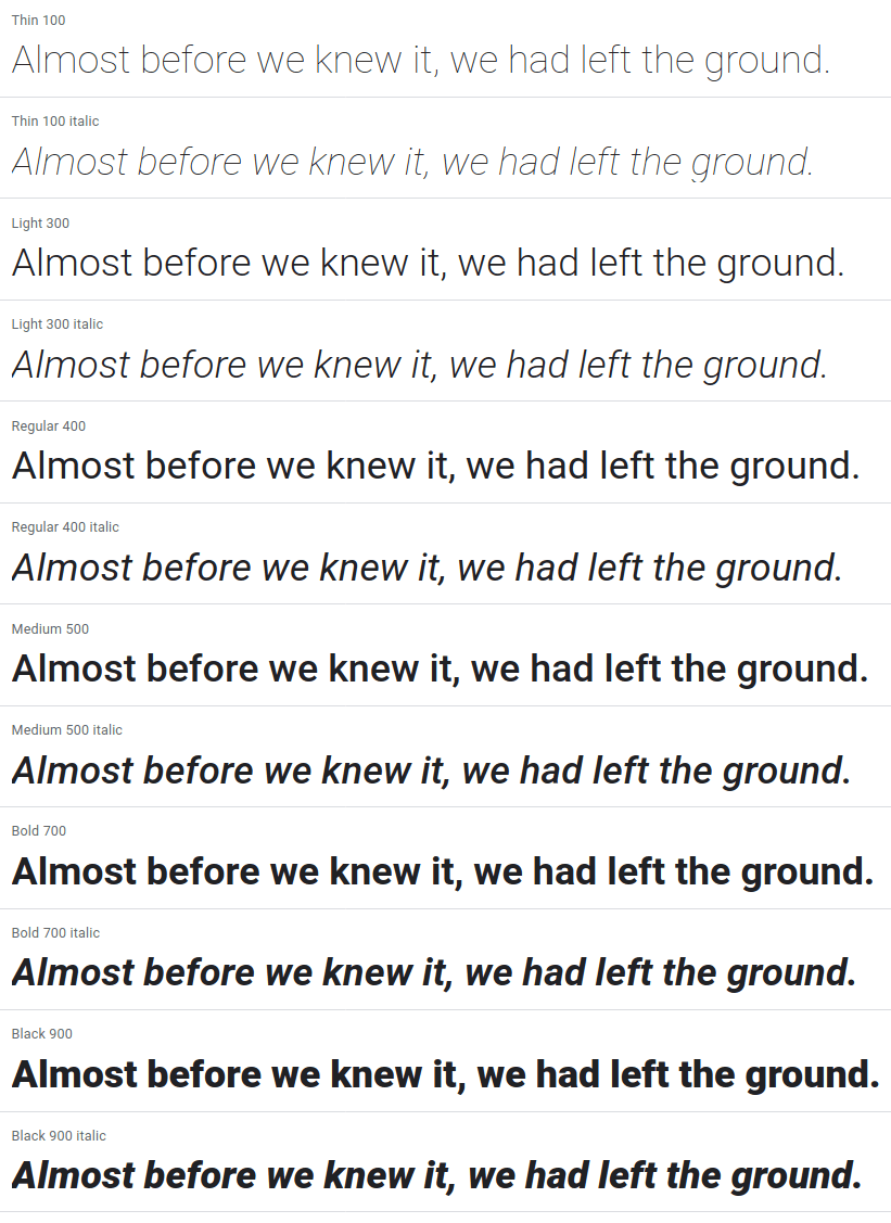
- font-weight
- Changes the boldness of the font. It can be set using multiple values. First, you can use a number between 1 and 1000. However, the possible values will be limited by the font you are currently using (likely some of those: 100/200/300/400/500/600/700/800/900). If you are using a variable font, you can use any weight value. You can also use a keyword: normal is a shorthand for 400 and bold is a shorthand for 700. If you use lighter or bolder, it will take the parent’s font weight and move it accordingly on a scale between 100/400/700/900.
- font-style
- Mainly used to switch between normal and italic
- text-decoration
- Changes the apparence of decorative lines on text. You can combine colors with underline/overline and a line style (solid/double/dotted/dashed/wavy)
Task: someone has made this text unreadable. Make it easier to read by using the good practices we’ve seen!
Font families and custom fonts🔗
We’ll dedicate this whole section to the font-family property. This property sets a prioritized list of fonts to use. The generic font families available on all browsers are: serif, sans-serif, monospace, cursive and fantasy.
A font family is a collection of font styles. When using the font-weight and font-style properties, it will try to use the related style if it is available.
You can add custom font styles with the @font-face directive. This directive needs two mandatory arguments:
- font-family: the related font family that you will use in font-family declarations
- src: a prioritized list of potential sources for the font files. You can use the local() to try to find the font on the client’s computer or url() to load it from a server. You should also hint the file type with the format() function (most font types are not supported by all browsers).
Here is what a font declaration might look like:
It can also include those optional properties:
- font-style: the associated value that will be targeted by font-style declarations
- font-weight: the associated value that will be targeted by font-weight declarations
- font-display: sets the behavior the browser should follow until the font is downloaded.
When including custom fonts, there are some caveats that you want to avoid. What will your browser show while the font is not loaded? And you don’t want your website to flash once it’s done. Here is a detailed article on optimizing font loading, the key takeaways are:
- Optimize your font files. Including multiple font styles can quickly amount to 500KB of data.
- Preload your fonts. If you have one hundred @font-face declarations and use only one, the browser will download only this font-face. However, to allow for this optimization the browser must read all the HTML and all the CSS before starting to download the font. You can preload the font by putting a link tag in the head of the document: <link rel="preload" href="/fontsmy-super-font.woff2" as="font" type="font/woff2">
- Set the correct font-display value.
The font loading is split into 3 periods:
- The block period: text elements using this font will instead use an invisible font during this period
- The swap period: if the font is loaded, the browser will use it. Otherwise it will use a fallback font
- The failure period: if the font is not loaded, the browser will treat it as failed and use a fallback font.
The font-display property can take these values. Use the one that you find will be better for your user experience!
- optional
- Extremely small block period and no swap period. What it means is that your font is not loaded super quickly, it will not be used. If it is that optional, you may reconsider using a custom font at all.
- block
- Short block period, infinite swap period. If your font takes some time to load, your users will see a flash of invisible text (FOIT) becoming visible.
- swap
- Extremely small block period, infinite swap period. If your font takes some time to load, your users will see a flash of unstyled text (FOUT) when your font replaces the fallback. On a slow connection, the user might see the swap happen dozens of the seconds after scrolling through the content.
- fallback
- Extremely small block period and a short swap period. Let some time for the font to load but if it takes too much time it will use the fallback. Thus there will not be a FOUT quite late in the page loading.
Variable fonts🔗
If you don’t need to support Internet Explorer 11 (and you shouldn’t), you can even use variable fonts. Here is a detailed article on variable fonts. In short, a variable font will encapsulate all possible styles in one unique file, reducing the overall bandwith required to download all fonts and thus optimizing the display speed.
In supported browsers, you will be able to specify a range for the font-weight and font-style properties in the @font-face declaration.
Task: use the given variable font to style all texts using only one font file!
If you use an external service to load your fonts (such as Google Fonts API), all the @font-face declarations will be taken care of.
What I should remember🔗
- New properties: font-size, line-height, word-spacing, letter-spacing, font-weight, font-style, text-decoration
- Set the font size using em and rem, the computed value of main body text should be between 16px and 21px. Line height should be around 1.5.
- How to use @font-face
- The three techniques to optimize font loading: lighter font files, preloading and font-display
- Variable fonts exists and will become the standard for loading font styles.